Making My Own Way.

I’ve had a few days now to really let the idea that I’m DYT Type 1/2 sink in. I find myself checking in against it often, and I’ve also seen a lot of patterns confirming this type. I’ve questioned it intensely in my mind, because…well, because I can see aspects of myself in ALL of the types.

Why not a primary Type 2? After all, I’m a notorious pile-maker, and I do worry a lot. Also don’t forget the fact that it’s said that one’s emotional reaction is always one’s primary type, so bring on the water works.

But what about Type 3? Lord knows I adore autumn colors and lots and lots of texture. And don’t I tend to have a stubborn, bullish kind of quality sometimes?

Sure, but Type 4. I’m a huge perfectionist. At times in my past, I’ve had people literally compliment me on my enunciation (which I thought was a rather odd compliment, to be sure). And one of my biggest word descriptors is certainly “stupid”…though I don’t know if I just see an extra dose of stupidity living in the city like I do, making it pop out of my mouth so often.

So, yeah. I guess I AM all of the types. And to some degree, that’s true. We ARE all of the types…in degrees. And figuring out the degrees of what is what is super important to me.

Keywords are generalities for sure, but once I sat down with some real honesty I could see that this is the right fit for me, and that a lot of my other behaviors are learned ones due to my difficult upbringing.

The huge problem I come across now is some differences of opinion, and this is the point where I decided I HAVE to diverge and go my own way on the Dressing Your Truth scheme.

The number one disconnect for me is the wearing of gold jewelry and accessories. Sounds kind of lame, I know. But what I do know for a fact is that gold isn’t the greatest on me. I really look good in silver. This, according to some, would kick me off the DYT bandwagon immediately, and though I still have an urge to do it one day, I’m kind of glad that I’ve not spent the money on the actual course. Anyone with some common sense can find out everything they need to know about this system to apply it very effectively to their life.

So what to do about the gold vs. silver debate?

Well. I have decided to keep my silver and continue to omit gold (except for maybe rose gold, though I’ve not tried it yet). At the same time, I know that a Spring type (Type 1) must be light and uplifting. So I will keep my silver BUT also make sure it’s very shiny, and not wear heavy pieces that will drag that energy down. I will also endeavor to ensure that it’s playful and fun.

These earrings are really shiny, not to mention super fun!
Circles in a design, with an opal (which is a very light, airy, and uplifting type of stone to me).
Adding an element of fun and playfulness to jewelry. And what could be more fitting for Ms. Kitty, eh? 🙂

Another problem I’ve had that’s almost as important as the gold vs. silver debate is the colors themselves. When I think of Type 1, this is what comes into my mind:

bright spring

And oh my gosh. This really feels like too much. I just cannot do these ultra-bright type of colors. I have a literal visceral reaction against them, like I’m nauseated. In fact, even posting that picture on here and looking at it makes me feel a wee bit queasy. So obviously that’s not good.

I don’t want to walk around constantly feeling like I might just throw up at any time. Ha.

I need a little more subtlety to pull off anything remotely Type 1…and realistically, maybe that’s where my secondary Type 2 comes in. In the course, you’re supposed to use Type 1 colors, metals, style, and lines with two or three different secondary Type 2 style elements (in my case, softening up the Type 1 energy a little bit). But I’d like to take it a step further. I’d like to take it here instead:

Still warm, but with lots of gray (Type 2) and more subdued but still cute and feminine.
An all neutral-based Type 1 look I found on pinterest somewhere. This is really doable for me, though it might feel a bit heavy (?).
Type 1 can have a lot of floral, depending on individual preference. I’ve seen a lot of floral patterns that are way too big, but this one is perfect. I’m petite, so I need smaller patterns to not be overwhelmed. Also, I would prefer skinny jeans over bootcut here. Let me add…I will never, EVER go to the acid washed looking jeans shown for Type 1s. I like and prefer dark washed jeans because they look more put together. Always.
Another lighter version, but still staying toward the warmer direction. I hate how this person mixed metals. I hate mixed metals, so that won’t happen. I also hate anything “distressed” and I loathe jean jackets, but everything else is quite nice, as well as being Florida appropriate!
Another mainly neutral type outfit. I’d do the colors well enough, though I would lighten up the cardigan to a lighter fabric. This one feels more Type 3 to me.
Again with the “distressed” jeans! Ugh. You know what makes me really distressed in real life? My clothes with holes in them. No. Just no. Everything else is pretty smashing, but change the metals to shiny silver.
Another neutral type outfit, with fun added. I’ve never worn a tulle skirt before, so I don’t know if I’d like it, but it sure is cute! And that cardigan is fabulous (also circles!).
I absolutely ADORE this sweater/shirt. The skirt is waaaay too short for me, but I could do it if it were modest, or pair with jeans instead. Love the color combination here, and the nod toward Type 2 in the waves (S-curves) on the sweater, then the pearls (circles) on the collar for Type 1. Scallops on the bag as well (half-circles). Cute!
This last one…may be a bit too bright for me. But the general idea I love. Neutral neutral neutral with a pop of color.

Anyway, those are my ideas. I’m going to continue to solidify this idea over pinterest. Follow me there through the link on the top of this blog.

Signature

Making My Own Way.

Feeling Out Soft Winter (Zyla)

It’s been awhile since I’ve written in here. Lots going on in the ol’ personal life, of course. That hasn’t stopped me from thinking about colors and style at all, though, let me assure you!

Recently, one of the wonderful women on the Facebook color and style groups offered to make vision boards for people, and I asked to be signed up. She did a wonderful, fabulous, AMAZING job…and now I wonder how I could ever have doubted Zyla’s Soft Winter for myself! So much so, I’d be highly surprised if I saw the man myself and got any other answer.

I’m not going to post the entire board, as it’s secret still, but I just waned to share a few of my favorite pins from it. I saw some things in the board that I’m frankly not too surprised about, especially in the colors. I’ve already recently figured out (and making a pinterest on it, of course!) that my primary, best colors are in the split complimentary color scheme. Reds/pinks. Cool greens that go very deep. And the one I struggled with for a long time: purple.

I won’t lie. I love lace. Love love love! I would do this with leggings since it looks well over the knee.
Antique-looking jewelry. I love this purple. I could do it in garnet too, I think (which would be sweet since it’s hubby’s birthstone!).
I must say…I love ankle boots. So hard. And these are adorable. Though I don’t know if I’d be daring enough to do them in purple. Shoes are so expensive when you’re buying good ones. I’d be more likely in real life to buy them in charcoal, so that they match more things. But if money were no object…yes.
I love the idea of a coat with a hood attached. I feel like…when I’m feeling sensitive, I could hide in it.
I just love everything about this dress. In real life, it would drag on the floor soooo much, because I’m super short. But I could hem it. Also adore the slight puff sleeves and the elbow length.
Mary janes? YES. Tights? Double YES!
I love the idea of this. The top may be a bit too revealing for me personally, but I love the drape and the slight asymmetry and the gentle details. I could make this modest enough to wear in real life pretty easily. Also…charcoal. One of my best neutrals.
Love the little nod to the SGness in me. I would absolutely wear this collar.
I love this particularly over the shirt. Looks Edwardian styled, without going into the frilly poet shirt type of thing, which I know is no good on me (and really, I do feel ridiculous in a frilly shirt). This, though…just perfect. Love the sleeves. Love the neckline. Adore that fabric. I feel like my patterns must be kept monochrome, which seems to be a SW thing anyhow. Busy patterns are distracting and overwhelming on me.
One of my personal best colors. Pine green. Love the velvet. I would do this in a longer length, and definitely with both sleeves instead of this asymmetrical type style. That’s all I need, to have one arm be hot, and the other freezing all day! lol
Don’t know if they call this wine or burgundy. I love the color. I love the waist. Love the flow. I’d have to figure out how to cover up my chest and arms…but it would be worth the effort. This is a color I’ve always been a little shy of. I’m always afraid to go too deep, because often deep gets vampy…and while I did a stint playing goth girl in high school, that’s really so not me. So I’m having a difficult time drawing the line between soft enough, deep enough, but not bite your neck enough. Ha.
Feeling Out Soft Winter (Zyla)

Breaking Down My At Home Drapes…

The worst of all the drapes was that bright, shiny white. That says no to BW to me.

The true black drape was a toss-up for most people, myself included. Some thought it was okay, some didn’t like it (found shadows thrown on my face, etc.) much. Does this say I can handle some depth? I don’t know. I’m not sure that I can, once other darker colors roll through. I feel that darkness is definitely not TMIT, that’s for sure. And to some degree, I feel like it drags me down. || The softer black on the red/black ombre was an immediate no, oddly because I thought it might be better than the above true black.

No one liked the charcoal pashmina, saying I should go warmer than that. Odd that so much of what I have is way too cool for me…

The brown lakeshore bliss pashmina…up in the air again on that one. A few people said they could see something they liked about it, or thought it was okay (but not great), but couldn’t figure out what. I don’t think it’s bad; nor do I think it’s great on me. It can work. Is it again a case of too cool? I don’t know.

The teal paisley pashmina was considered also too cool by most, although one person said out of what I had posted, she liked it best. One person said it was draining, and I agree.

True red? “Not the best. Too bright (two people). Yellow on the face.” The softer red seemed to be getting there, but still considered too cool.

The dark brown side of my tan/brown ombre scarf. Want to say no but not sure why. Probably too cool again. The light brown side was immediate no all around.

…am I warmer than I thought? Hmmn.

The muted gray/blue/cream scarf was generally considered blah by everyone. Not bad, but not WOW.

Cream 2in1 considered “nice”, “not bad”, and “better than white”. Hmmn.

Avocado 2in1 was a tossup for some. One said lots of shadows (and I agree) making it bad. Another said not bad, but not great and probably too cool, again. I’m more to agreeing just not good, period.

Surprisingly, the teal 2in1 had a better reception, even having a few people say they actually liked it. I still wonder if it’s too cool? One said my skin looked even toned, but not washed out. I think I looked even toned, but a tad greenish here.

Everyone hated orange, which is fine, because so do I! Lol

The light pink side of the light pink/dark pink ombre was considered too light, too cool, and too icy on me. One person said “This makes ur skin look sickly almost. Like it gives it an ashy greenish Yellow tone that isn’t really there.” …eww.

The darker pink side of the last scarf was better, according to most, but still not quite there. On the right track. Still too cool, said someone. Even I said “feel like SSu is a little too cool for me; I think I do need some warmth, but it’s not TMIT. Maybe SA like Lou-Lou suggested?” Later on, I went back to SSu and stuck with it for a while, but now I’m doubting it again and thinking I really need to go warmer. Hmmn.

No one liked the taupe 2in1, which is fine because neither do I. I see shadows, uneven skin, bags under my eyes, and odd colors on my face. Yuck.

Navy and muted pinks NYBs were considered too cool again, or in the case of the pink, just plain no. Funny that later, I did the muted pink one with full face SSu and people thought it was fabulous on. Goes to show you can’t trust makeup. It only worked WITH the full face makeup on.

The light gray scarf with the shiny silver threads was called “not bad”.

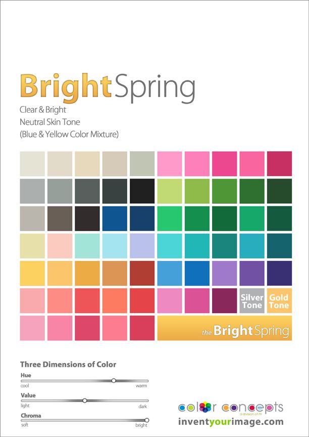
The SUNNY YELLOW one was where things started getting weird (and confusing for me. Lol). I got a TON of comments on this one. First said she liked something about it, though there was a little bit of reflection around the chin (agreed on the reflection). Much better than bright, and muted seems to be more my direction. One solid YES and several more not bads and I like it but don’t know why. Some said pretty good. Someone took the same picture and muted it out just a tad to a buttercup/goldenrod typed yellow, and it was VERY nice, IMO. Two people said TA COLORS are CLOSE but not quite. One said check out spring (I SHOULD check out True Spring in this case, though I can’t imagine that I’m pure warm, that just doesn’t make sense! o.O). One said “My first, off the cuff guess was a bright spring, but I think Tabitha‘s skin is more ‘sombre’ and also there’s the mauve aspect …” …now, regarding mauve, I don’t know if that’s quite right. I think it needs to be a little more peachy mauvey to be correct, now that I’m looking more objectively about things. I do agree that my skin is more SOMBRE than bright spring, and all the bright stuff looked godawful on me. Warm spring was linked as a picture…and I kind of like it. o.O again. …and then all of a sudden, Lou-Lou said that the more she looked at me, the more she saw cool tones with olive, and the conversation just swung way away from the colors and into the composition of my skin. Yes, I sure am olive (blame the Portuguese and Italian on that), but I can’t decide if cool or warm. I think neutral leaning warm now, since trying SSu this whole time and finding it too cool and a bit too brown/autumny. Someone at this point even linked to a True Autumn (dunno…I’ve had so many people say they love shiny silver on me, even though I CAN do gold, too). And this was me: “I find anything peachy or coral to make me look feverish, and anything brown to look muddy.” Still holds true, in regards blush. And I said this, too: “On Truth Is Beauty, I’m reading their article on SSu. This statement feels VERY much like me: “As a Soft Summer, your very worst colors are bright.” I think about that royal blue in the album (awful), the lime green (ugh!) and that super yellow (if anyone’s ever done the buttercup buttercup game as a child, that’s how I felt!). I feel like bright is the WORST I can do, period…which is making me think leaning Soft one way or the other (or maybe the Deep Softs…) makes a loooooot of sense!” True that my WORST colors are bright. I think second worst are dark, because of this: “I actually feel really good and very much myself in lighter colors generally (over darker, which feel like I’m being weighed down emotionally, thus making me feel like DA wasn’t an entirely good fit).”

Moving on to bright yellow, and it was AWFUL. HORRID. Bright really is the worst I can do.

Lime green was also horrid, awful, and vomit-inducing. I looked entirely green and pale, and pretty much looked like I was about to puke the entire time. NO to brights!

Someone did like Richard’s burgundy shirt (though one said maybe too cool). I find it pales me out and overwhelms me to some degree. More “here’s burgundy” and less “here’s me”.

The dark greenish gray was immediate and all around no.

Royal blue: too cool, too bright. And as far as I’m concerned, also too SHINY.

The Irish green shirt was said to be something likeable by several people. Lou-Lou said green reflection, shadows, and ashy, and I agree with her.

The muted green was meh all around.

~*~*~*~*~

Soooo. What is all of this telling me?

NO BRIGHTNESS. This is my number one worst thing overall.
WHITE WAS THE WORST OVERALL DRAPE. No to BW/TW.
Black was not great but also not awful.
Most everything I have is too cool. This says to me, go warmer.
Darkness is a tossup. Some say yes. I say passable, but feel more medium at best.
There was a lightness level that looked too light…but I wonder if it looked too light because it was TOO COOL, or because it was actually too light.
Some softness seemed good. Also some warmth. Though I did get quite a few comments about TA or True Spring, so maybe I should look at those.

Okay. So NO TO THE BELOW:

NO BRIGHT WINTER
NO BRIGHT SPRING
I’M NOT TRULY COOL, SO…
NO TRUE SUMMER OR TRUE WINTER.
NO DARK AUTUMN OR DARK WINTER (FELT TOO HEAVY/HARSH).

……….

So this leaves the possibilities of:

LIGHT SPRING
LIGHT SUMMER
SOFT AUTUMN
SOFT SUMMER
TRUE SPRING
TRUE AUTUMN

……….

And of those, I’ve almost entirely ruled out Soft Summer because it is bland on me, slightly graying, a tad too cool, a tad too brown, and I have to wear full face makeup with it to make it work.

So narrowing it down further still, these are what I have to work with:

LIGHT SPRING
LIGHT SUMMER
SOFT AUTUMN
TRUE SPRING
TRUE AUTUMN

……….

It may be possible that I’m warm after all. I’m going to look at these above and see if they fit. I’m especially going to pay attention to the makeup (lipstick/gloss) recommendations, because that was a tip off for me with SSu. I feel that I should be able to wear literally JUST some lipstick/gloss without putting anything else on my face (foundation, concealer, blush, etc.) to “pull” a look together.

Signature

Breaking Down My At Home Drapes…

Laying Sci-art to Rest.

Well. Yesterday, I finally sat down and posted a whole bunch of real life drapings for the Figure My Season Facebook group, and the results were fairly well unanimous. What’s my MIT? Darkness and some warmth.

Ladies and gentleman, I’m Dark Autumn.

Which I kind of have been thinking for quite some time anyway, so!

Now all I need to do is figure out how to get myself a fan, and then I can start shopping for fabrics to make stuff with!

The funniest part about all of this is that I’ve always felt for sure that black is so bad on me. In fact, there was quite a lengthy discussion about the black and what it was doing to me. It turns out that everyone else thinks it’s really not so bad at all, and that I can handle that kind of darkness. Some even said they saw some skin clearing, too, though it was generally said that black is not The Best on me. A very dark almost-black or a softer black would undoubtedly be well. So how about that?

Burgundy was well liked, as well as, surprisingly, this medium sunny yellow. The yellow wasn’t perfect, but was nice on my skin. It did cast something of a shadow on the sides of my face, though, so the yellow color wasn’t just so, but there was something to like about it (so sayeth multiple people). I think it would do well were it a little browner and taken into the goldenrod territory. So now, I’ll be on the lookout for goldenrod-colored things as well! Pure white was an absolute, unanimous NO, which I guessed myself because I look very sickly in white. No one at all liked the charcoal gray, but I think if it were warmer (gunmetal?) I would like it a lot.

Dark brown, if warmed up some, was liked. I would like it too, but it’s so hard to find warmed up browns that aren’t TOO warm! The light browns/taupes were not well liked in general, because I needed more darkness than that. Cream was great, which is what I expected as I like it very well myself. The avocado green 2-in-1 was liked, though I saw some reflection under the chin, as well as the teal one. Which is awesome because I picked out both of those after having determined initially that I was Dark Autumn, and shopped them online using the palette (above) which I have saved on my computer! 🙂

It’s odd that almost all of the scarves I own are cooler, or at least far too cool for me. That was the general concensus: “This is far too cool, that is far too cool”…although there were a couple of instances where something was too warm, namely the rust/orange scarf I have. I’ve always kept those colors far away from my face, though, so no harm there. Up close both were dastardly, although I will say that all of the commentary about it was dead set against the orange. Which I knew all along. Orange is BAD on me. BAD. …AND the reason why I didn’t think for pretty much forever that I was an Autumn at all, because I could not wear orange well. Of course, I was imagining pumpkins and the like, which are for a True Warm Autumn. No, I am not that. I do have some neutral, too, and lean darker. But I’m told I ought to go a lot warmer than what I have been doing. Almost everyone commented on how they would like to see me in warmer recs, just to see what it would do. Alas, I don’t have much and draped literally everything I had to work with.

I was extremely gratified that everyone else saw that Brights were too bright for me. The true red was a definite no, as were the royal blue and the lime. Between the three it was easy to rule out Bright Winter and Bright Spring altogether. Which is good, because I hate both! I almost had a panic attack when I was doing the digital drapings in GIMP and was told by Buffy that she liked the Brights the best. That, I’m afraid, may have been a case of “I like the colors that look well on ME, not you”…just like I did when she was posting up what everyone else thought SHE was. I said I thought she was Dark Autumn. She turned out to be Bright Spring.

The teal paisley pashmina wasn’t entirely liked, however there WAS something about it to like. Going warmer was suggested, as it looked a touch too cool.

LOTS and LOTS of comments of this or that are ALMOST good, but a bit– or WAAAAAY!– too cool.

I need to work on my eye some to make sure I buy the right things.

Next order of business is to try and get myself a fan! If I can somehow manage to make one from this palette out of paint chips, I will SO do that! Otherwise, I’m afraid the palette strip will have to wait till tax time next year.

Signature

Laying Sci-art to Rest.

TMIT.

…an abbreviation for The Most Important Thing.

And so I wonder…what is MY Most Important Thing. I think I’ve been going at this color thing all wrong. I’m trying to match up my hair and eyes to something, and reeling in the understandings of others on which thing is my Most Important. But the truth of the thing is that it’s not the hair or the eyes that is important, it is the skin and how it reacts to things. And since I have no way to drape myself and see what is or would be best, I have to instead figure out what my Most Important Thing is.

Christine Scaman on her website 12 Blueprints says this of The Most Important Thing:

“There are three dimensions or measurable properties of colour that we use for personal colour analysis:

value – how light to dark

hue – or heat level, how cool to warm

saturation or chroma – a colour’s position between the most grayed version of the colour and the purest version of the colour”

And what I must consider is which of these is the most important for my skin. At this point, all I have is this:

* Lightness to darkness: I appear dark because of my hair and eyes, but darkness doesn’t do me any huge favors. It’s only because of the darkness of my hair and eyes that I can carry it off to some degree.
*Coolness to warmth: Warm is better than cool by all means, but it is certainly not TMIT about me. I have already tested a variety of cools, and they are BAD.
*Saturated to grayed: I don’t know about this one. My head wants to say not saturated, and if this is brightness level, I am most certainly NOT bright.

Here’s what I DO know about myself:

*Anything with brown in it turns my skin to mud, especially if it’s a lipstick. I can tolerate types of browns on my eyes to some degree.
*Black turns me extremely pale. See this photo:

DSC00002
This look would be awesome if I were, say, a goth. lol

*Coolness is not my friend. Charcoal on my face looks awful. I’m definitely NOT cool.
…to be continued.

Signature

TMIT.

And to compare…

Not sure if this would be Dark or Soft Autumn. I’m inclined to trust the palette I made more than someone else’s. I’m going to check out a few more, too, like maybe even Dark Winter or Soft Summer, and see how the comparison goes.


Dark Winter (which at one time I thought yes to) seems like a definite nope!

Soft Summer
This is VERY close…but I think it’s a smidgen too cool. The grays here are fabulous, and the 2nd Base is *almost* there, but I lose some of the greens which are so essential to my palette (since they’re my eye colors). So, hmmn.

Signature

And to compare…

Finding your season.

The following is a direct copypasta from truth-is-beauty.com

None of it is mine, but I’m posting it here because it’s very helpful for me. Unfortunately, I can never find anything with the 16 season color set because I seem/feel that I fall somewhere between the Soft Summer and Dark Winter… That would make me a Dark Winter Soft (more likely because of my dark brown hair and dark hazel eyes) or Soft Summer Deep (because of the muted coloring I lean toward, though this palette is often too light for me).

******************
Method #2: Lipstick Draping
One of the easiest ways to narrow your season down to just a few contenders is to try lip colors that correspond to each season.

If a lip color is right for you, it will appear balanced with your skin. It will look natural, not peculiar. It will make you look better rested, healthier, and even younger. It will seem to reduce the appearance of shadows, blemishes and lines on your face.

If a lip color is wrong for you, it will repeatedly drag the eye away from the rest of your face. It will appear out of balance with the rest of your face. It may make you appear tired or sick. It may give your skin an unnatural color. It may appear to be the same color as lines, blemishes or discolorations on your face.

For each season, I’ve listed one higher-end lip color that you can probably try at Ulta, Sephora, or a department store, and one less expensive color that you can buy (relatively) cheaply at a drug store.

* * * * * * * * * * * *

If you’re a Bright Spring, you’ll look natural in

MAC Lady at Play
Covergirl Lip Perfection Delight

* * * * * * * * * * * *

If you’re a True Spring, you’ll look natural in

MAC Made to Order
Revlon Super Lustrous Siren

* * * * * * * * * * * *

If you’re a Light Spring, you’ll look natural in

Chanel Rouge Coco Shine Liberte
Maybelline Born With It
* * * * * * * * * * * *

If you’re a Light Summer, you’ll look natural in

MAC Lovelorn
Maybelline Pink Wink
* * * * * * * * * * * *

If you’re a True Summer, you’ll look natural in

MAC Up the Amp
Maybelline Darling Pink

* * * * * * * * * * * *

If you’re a Soft Summer, you’ll look natural in

MAC Syrup
Revlon CColorstay Preview

* * * * * * * * * * * *

If you’re a Soft Autumn, you’ll look natural in

Clinique Buttershine Apple Brandy
Revlon Super Lustrous Blushing Mauve

* * * * * * * * * * * *

If you’re a True Autumn, you’ll look natural in

MAC Chili
Revlon Super Lustrous Sandalwood Beige
* * * * * * * * * * * *

If you’re Dark Autumn, you’ll look natural in

MAC Brickola
Revlon Spicy Cinnamon

* * * * * * * * * * * *

If you’re a Dark Winter, you’ll look natural in

Merle Norman Stolen Kisses
Rimmel Moisture Renew in Berry Queen

* * * * * * * * * * * *

If you’re a True Winter, you’ll look natural in

Estee Lauder Long Last in Red Apple
Revlon Colorstay in Muse

* * * * * * * * * * * *

If you’re a Bright Winter, you’ll look natural in

MAC Girl About Town
Revlon Cherries in the Snow

Method #3: Identify Your Worst Colors

As confused as we may be about our true colors, we often instinctively know one or two colors that we must avoid at all costs.

For example, long before I knew I was a Soft Autumn, I knew I was terrified of fuchsia and bright red.

Find a color that scares you on the list below, and it may bring you closer to identifying your season.

If bright red overwhelms you……you may be a Soft
Autumn.

If you look awful in bright coral……you may be a Soft Summer.

If peach does absolutely nothing for you……you may be a Dark Winter.

If seeing orange next to your
face makes you feel physically ill……you may be a True Winter or Summer, or a Soft Summer.

If your worst color is
yellow-green……you may be a True
Summer.

If golden brown turns
your skin yellow or makes
you look sick… …you may be a Winter, or
a True Summer.

If beige and tan make your skin look
sallow or lifeless………you might be a Bright
Spring.

If your worst color is
pastel blue……you may be a Bright season, or a True Autumn.

If lavender drains the life from your face……you may be a Dark
Autumn.

If fuchsia washes you out
and looks harsh on you……you may be a True Spring or Autumn, , a Soft Autumn, or a Light Spring.

If burgundy makes your
face seem colorless……you may be a Light
Spring.

If black makes you look
pale, tired or sick……you may be a Light
season, or a Soft Autumn.

.

Method #4: What tricky color do you look great in?

Warning: To be objective about this, get a friend’s opinion. Don’t trust your own judgment. If you already knew your best colors, you probably wouldn’t be reading this.  😉
If black makes you
look healthy and alive ….
If you look awesome in
yellow-green…If you look vibrant and natural in brown…If you look fantastic in
bright fuchsia…

If you look alive in olive
green…

If you get compliments in pastel blue…

..you may be a Winter, Dark Autumn or Bright Spring.

…you may be a Spring.

…you may be an Autumn.

…you may be a Winter, or a Bright Spring.

…you may be an Autumn.

…you may be a Summer.

Signature

Finding your season.